Friday, 30 May 2008

Corner Gallery, Biscuit Factory

Got the paintings safely to the gallery today and after a surprisingly short session of mill-about, how-about-this-one-here-and-that-one-there, we settled on a decent hang. In this respect, we relied on some good advice from Mel, the curator for the show - always best practice I find when there are possible arguments developing about the use of space. All of our pictures have been mixed together, contrasting size against size, but picking up colour notes which carry through from one painting to another. Over all, I think it works well. This is the selection of my own that I decided to hang. It was an opportunity to put together paintings from the last three years (I've put the year of origin in to give you an idea) in a venue where many people won't have seen them before.


Before the Run 2006 (Oil on canvas, 36 x 36 ins) - sorry, this is the best photograph I've been able to take so far.


Yellow Hats and Red Balloons 2006 (Oil on canvas, 20 x 20 ins).


Venetian Regata 2008 (Oil on canvas, 24 x 24 ins)


Aegean Hideaway 2007 (Oil on canvas, 20 x 20 ins.)


EROTOKRITOS 2007 (Oil on board, 12 x 12 ins.)


Alleyway in Crete 2008 (Oil on board, 9 x 9 ins.)


Wooden Sunset 2005 (Oil on canvas, 24 x 24 ins.)


Engine Summer 2005 (Oil on canvas, 40 x 40 cms.)


Venetian Wall 2005 (Oil on canvas, 40 x 40 cms.)

A pretty disparate bunch, I guess, and I'm hoping that scattered as they are throughout the show, they won't appear too mismatched. I dunno. What do you think?

Thursday, 29 May 2008

Venetian Regata


Venetian Regata (Oil on canvas, 24 x 24 ins.)

I've had to really bash on to get this one finished. I need it for tomorrow, when it will form part of the new Figure 8 show at the
Biscuit Factory. The show doesn't get its preview until 6th June, but the work needs to be in a week early.

I had planned to put some of the Vaporetto series into this show, but they don't come out of the
Myles Meehan Gallery until Monday, so I've opted for a mixed bag of work from the last two years. This new painting and one other (another of my old, unfinished pieces which finally found its way to completion this week) will be the only fresh work in my part of the show, but the audience for much of it is unlikely to be duplicated, I think.

I am a little concerned that, because of the experiments in approach I've undertaken in the last couple of years, my work may look a little eclectic in style. My hope is that the colour palette will hold it together and, if nothing else, it'll give me a chance to see how well (or otherwise) it all hangs together.

I think I may post everything here tomorrow (if you're interested?), when I've had a chance to photograph the other new one, and when I'm sure of what has gone up on the walls.

Wednesday, 28 May 2008

Worry


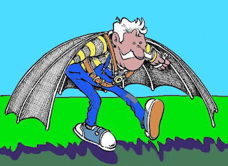
I'm still thinking over Tina Mammoser's suggestion that I create another blog on which to post sketches, and possibly these exercises in Photoshoppery. Meanwhile, because the trip to London interfered with time available to do an original, here's another of my cartoons newly coloured in Photoshop in response to Illustration Friday's brief, Worry.

Back from London

Back from several days in London. It seems by going there, Patsy123 and I left behind most of the good weather. Although we were able to sit in our friends' garden for breakfast on Friday, for the rest of our stay there the whole south of England sat under a belt of rain, while the north basked in sunshine. Bugger.

In an effort to kick-start some drawing and sketching, I'd taken along a little sketchbook and tried to get down the woman opposite without attracting her attention. I don't think I managed it, because she shifted position soon after I'd started and rested her chin on her hand . As a result, I wasn't able to get the articulation of her glasses and bridge of her nose right.


Passenger (A6 sketchbook, rollerball)


The weather was such that, although we went to Cambridge for the day on Monday, we weren't really able to go to see Kettle's Yard, something I've wanted to do for a very long time. Oh well, I'll keep it on my list.

We did, however, go to the National Gallery on Friday to see Alison Watt's exhibition, Phantom. Beautiful, cool, sensual. Big. If you go, it's well worth taking the time to watch the short film about her making of the pictures. You may find yourself wondering, as I did, why she thought it a good idea to load her brush with a little paint, climb a stepladder to apply it, then climb down again and repeat the process without stepping back to view what effect the first few brushstrokes had had.. A little hand-held palette would have been so much easier.

From Alison Watt's huge paintings, we went round the corner to the utterly delightful exhibition of mostly small works by Melita Denaro.at John Martin of London. Painted mostly plein air, her landscapes of Ireland capture the damp and blustery atmosphere perfectly.

We had the opportunity to chat with Denaro herself, and found her just as fresh and charming as her pictures. She seemed genuinely surprised and delighted to learn that I'd gone there deliberately to see her work and not just wandered in off the street.

Tuesday, 20 May 2008

Wide


I aim to spread my wings a little. I think part of my failure to get more drawing done is an over-concentration on oil painting. There are other skills I want to develop, including digital ones. So, this is a first attempt at colouring one of my cartoons with Photoshop. I'm going to post it on Illustration Friday, although without a thumbnail. Thumbnails and I don't see eye to eye, it seems. Those who understand and get along with them, might offer assistance, which would be gratefully received.

More Drawing Angst.


Mont Louis (A5 sketchbook, Rotring Art Pen)

I was reminded of this sketchbook drawing by some reading I've been doing across the blogs.

James Hobbs says in his blog, "Cafes remain a favourite place for me to work. They are often fantastically located, in the heart of a town, offering outdoor seating, tables to spread out on and plenty of refreshments."

I understand this absolutely. I still recall making that drawing in Mont Louis, on a walking holiday in the Pyrenees in 1991. Half way through the day we sat at a cafe table and ate our lunch, while I took as long as I felt necessary to make the drawing of the building opposite, refreshments arriving as required.. The fine lines are an indication of how my eyesight is not now what it was, and it was done with the instrument I loved so much then, the Rotring Art Pen. The damn thing seized up long ago and nothing I've been able to do to it has unclogged the nib. I'd buy another, were it not for the fact that I did buy another and the same thing happened to that. If anyone knows how to unclog them, I'd love to know.

It's become increasingly obvious that there's a huge movement around the blogosphere to encourage drawing and looking at this sketchbook makes me think again about how little I do myself.

There was a time when I did nothing but draw. By which I mean, I hadn't started to paint. I made images only with pencil or ink. Colour was actually something I avoided like the plague. I couldn't come to terms with it. At school, I would drag out the drawing part of the exercise so that I wouldn't have to "colour it in" and ruin it.

I began to paint seriously in 1989 and it's been a long hard slog to get to grips with colour, and colour and I are still wrestling with one another. In the process, I've allowed my drawing practice to fall away.

I'm not sure why this should be. Perhaps once I stopped having to make artworks in my spare time (when the actual lack of time meant that a black and white image was a more economical use of the time), it didn't feel necessary. I don't know.

Maybe the need to create paintings to sell and prop up the sybaritic lifestyle to which I've become accustomed led me to feel that a drawing would not contribute to my welfare (despite having sold several drawings in the past). Perhaps.

Some of it may be to do with my working methods. In the early days of my painting, I would take a photograph, run it through the office copier and make a charcoal drawing from the photocopy. The resultant painting would come from using all three - the photograph, the photocopy and the drawing - as source material. But as time has gone on and my abilities have improved, I don't need to do that now, because I can make some of the adjustments that the process achieved, in my head.

As a result, I find that I only seem to draw when on holiday and even then, not a great deal. The drawing above is from a sketchbook started in 1990 and still less than half full. I really must rectify this, but how to do so, when all my good intentions to do so have so far failed? Maybe I should try to get involved with some of the blogging initiatives that I see happening, like the Moleskine Exchange project that Casey Klahn is about to take part in. But how do I get involved in something like that? Anyone care to throw me a lifeline?

Tyneside Cinema

Last night Patsy123 and I went to the Tyneside Cinema for a free opening night. It opens to the public on 22nd May, but last night we were given drinks, a free showing of IRON MAN, and a chance to look round the newly refurbished cinema.

IRON MAN was excellent, and it was worth waiting until the end of the (very long) credits for the extra teaser, even if we were amongst only a half dozen to do so.

The refurbishment of the cinema is a triumph, however. The original 1930s look has been retained and enhanced by uncovering glass mosaic floors and hand-painting the ornate plaster work. There are now three screens, all with good comfortable seats and lots of leg-room. The extra screen was accommodated by fitting in an extra floor, a difficult thing to do in a listed building in a conservation area.

We got to look round the digital film-making and editing suites and the for-hire Digital Lounge where they were showing a tremendous video piece by Daniel Shiffman based on the movie, RUN LOLA RUN. They could accommodate only a 20 min section of it, but it was still great. Basically, each image on the screen is one frame behind (or ahead) of its left (or right or up or down) neighbour. In theory it's possible to watch the whole film by concentrating on one frame, but in effect it becomes impossible - you become entranced by the shifting patterns. Amazing! This is what video installation should be.


Run Lola Run Lola Run Lola Run Lola Run from shiffman on Vimeo.

Monday, 19 May 2008

Anniversary Review

Somehow the fourth anniversary of this blog (14th April 2008) slipped by without my noticing. It hasn't been an unalloyed joy, but I still find the act of publishing stuff here quite fascinating.

However, I'm coming round to the view that changes must be made. I tried a while ago to move to a new template, one where I can make amendments to the look of the thing without having always to fiddle around under the bonnet, adjusting the HTML. That didn't work nearly as well as I'd hoped, so I panicked and ran back to this more modest end of Boogie Street.

Did anyone else find it unnerving to make the switch to a new template?

For the last couple of weeks or so, I've been running a private blog created with a new style template and have discovered how to avoid many of the mistakes I made on my last attempt at the Street's modernisation. I like the way it looks and I'm sure the regulars who come here hoping (in vain, I'm afraid) to learn What Boogie Street Means, or What Happened to Jimmy Nail would appreciate the new look, too.

I've thought about changing the title to put an end to the Searchers for Meaning, but I'm rather fond of it now and, although it hasn't anything to do with the main subject matter of the blog, it still means something rather special to me (even if it might not entirely accord with what Leonard meant when he wrote it).

But what do you think? I'm genuinely interested.

Thursday, 15 May 2008

New Venice Picture


Venice Regatta (1st stage)


Venice Regata (2nd stage)

This is what I'm working on at the Club at the moment. The first image is how it was when I got there this afternoon, the second how I left it a couple of hours later.

Not a great deal of difference, I'll grant you. It's moving slowly, I find, and there are definite problems in some areas, most notably right in the centre. There's a problem with the reference photograph which I'll probably have to resolve by sheer invention. And I'm wondering about the red bias - there may be too much of it. But other than that, I'm relatively happy with the way it's turning out. I have a couple of weeks to finish it in time to put it next to my colleagues' 24 x 24 inch paintings at the next Figure8 show.

Friday, 9 May 2008

Arte y Pico


It's always encouraging to get some recognition, so I'm delighted that that nice Kasey Klahn at The Colorist has bestowed the "Arte y Pico" virtual award on me. The award is given for blogs that show "creativity, design, interesting material and also that contribute to the blogging community no matter what language."
I now have to pick 5 blogs who deserve this award for those same reasons. In the hope that I don't end up creating an incestuous Arte y Pico community, these are my choices:
Read the rules and follow the meme, bloggers. Or not, if that's what takes you. I'm no bully.

Wednesday, 7 May 2008

The Oak Citadel


Oak Citadel (Charcoal, charcoal and coloured Conte on A3 cartridge)
It's been my intention for some time to try to work on drawings outside which are bigger than sketchbook size. Oddly enough, although I've done it in the less agreeable surroundings of Newcastle, I've never really attempted it in the countryside.
This time I went prepared. I had with me a Mapac bag containing an A3 pad of Winsor & Newton Medium Surface cartridge paper and all manner of drawing stuff - charcoal, compressed charcoal, pencils, pastels and coloured Conte. And a new can of fixative. The fixative is really important to my working method. I spray as often as is necessary, rubbing down elements of the current drawing and spraying again, until there develops a crystalline tooth to the drawing.
Despite my preparedness, I still didn't achieve what I set out to do. Mainly because I hadn't prepared myself for something outside my control - the wind. The thing about little pieces of charcoal, Conte sticks and the packs they come in, is that they're very light. So a great deal of my time was taken up with rushing about retrieving materials and generally cursing the elements.
I know it's a poor workman who blames his tools, but I also found that my choice of medium surface cartridge was a mistake - I really don't like the rather mechanical tooth it's been prepared with. Maybe the other side would have been better for my purposes, but smooth would have been best of all.
Anyway, after a considerable time cursing and grunting, a black cloud came and threatened me and I was forced to give up. So the drawing as it stands lacks a certain definition in the trees. The trunks don't seem to have sufficient body and even the rocks are a little anaemic. I do like the way the shadows of the branches are cast over the rock face, however: something I would find difficult to invent because even standing in front of them, I couldn't figure out which branch was casting which shadow.
I may return to it in the studio when the time is right.

Tuesday, 6 May 2008

Compo & Clegg Week 2008


Tree & Rock (A4 sketchbook, pencil, Inktense pencils)

You have to play the cards Fate deals you. As I sit here typing in a hot room, the sun streaming down outside, I ponder on events which led us to book last week in the Lake District, rather than this one. Because, of course, last week was your classic Lake District week, all rain, sun and showers.

But it doesn't pay to ponder too long. We booked the week we did, and we played the cards we were dealt. So we ended up having a good week, although the work we produced was limited by the weather.

The drawing above was my first attempt at getting to grips with what seems to be becoming something of an obsession when I go out into the country - trees and rocks. I'm not all that convinced by it, but there are things about it that I like. I still don't find the
Inktense pencils particularly good to work with, but no doubt I'll return to them at some time in the future.

The tree growing out of a cleft in the rock was at the side of a lane running up past a farm in
Near Sawrey towards a tarn at Moss Eccles. It continued to exert a fascination for a few days and when I found the weather too bad to go out and work, I had a go at working from the first sketch and from memory on something more colourful.


Tree & Rock (12 x 8 ins, watercolour paper, mixed media)


I started out with a pencil and watercolour pencil drawing, then added gouache because it wasn't working right . After that, I guess it just developed a life of its own. I worked over it with coloured Conte and some pastel, rubbing it down now and then with an eraser and frequently spraying with fixative.

I rather like the end product, although it does seem a little strange. But then I've never been averse to the strange.


Tree in Rock Cleft (A4 sketchbook, brush pen)

I ended my engagement with the tree in the rocky cleft by moving round to the opposite side and doing this drawing in Pentel brush-pen. As I usually find with black markers of whatever kind, I ended up rounding off the forms - a remnant of my cartoon days, I think.

At the bottom of the valley from our cottage lay Esthwaite Water, and in a field by the side of the road running down to the lake I came across a massive rock outcrop on top of which were several old and gnarled oaks, their roots bursting through the seams of rock.


Oak & Rocks (Sketchbook, 8 x 9.5 ins, 4B pencil)


I liked these rocks. They had great presence and genuinely interesting fissures running in parallel lines through them. The oaks sat on top, feeding their roots down through the fissures and splitting off great slabs. And one old oak, over the years, is clearly edging his way off his pedestal towards the road. Beware.


The Oak Steps Down (Sketchbook, 8 x 9.5 ins., 2B mechanical pencil)