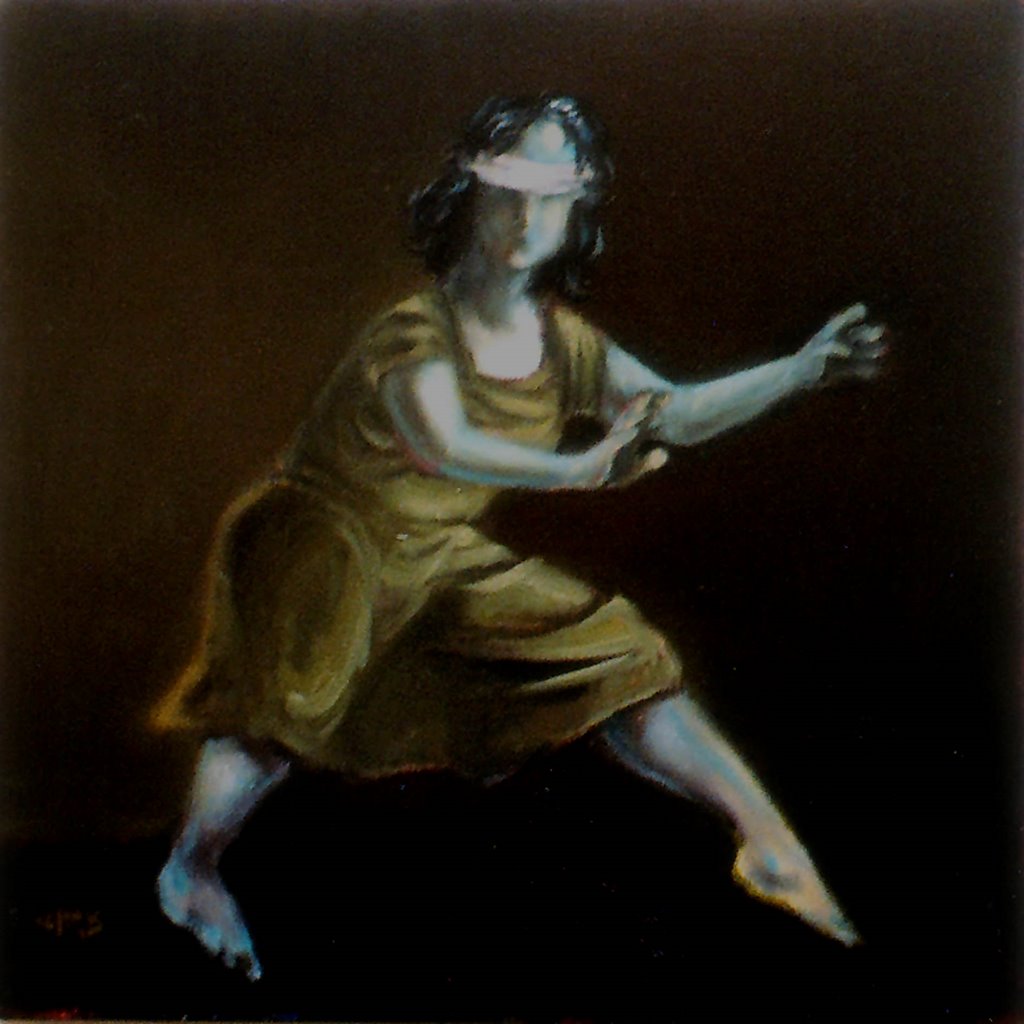
The Blindfold (oil on canvas, 16 x 16 ins)
[ An experimental painting with a tenuous link to the post. It was actually inspired by Siri Hustvedt's novel of the same name.]
In several comments on other blogs recently, I've mentioned the fact that I'm colour-blind. Specifically, my perception is deficient in the red-green range. Lots of people when they learn this wonder how on earth I manage to paint, but really it doesn't cause me much in the way of problems these days
For a long time I was unsure of colour and tended to limit myself to black and white drawings. It wasn't until I decided to buckle down and learn to paint, that I found all I needed was an understanding of colour-mixing. And when it came to red, I simply made a red that looked like what I could see.
There are times when I go against what I can see, however, and then I worry a little about how it might be perceived by others. I remember once deliberately using a Constable trick: I put in a spot of indian red on a traffic light in a painting to draw the eye. It didn't draw my eye particularly, but it seemed to work OK - the picture won me my first painting prize.
Reds vary, of course, and I find I can see red-orange more easily than red-violet. And when they appear in combination with green, I start to have practical problems. I don't often notice berries on trees, or poppies in fields (expect no Monets from me!) until they're pointed out to me, and even then, I'm underwhelmed by their vibrancy.
Green I dislike immensely, unless it's an earthy green like olive green. Don't like to paint with it, don't like to even wear it. I am unlikely to produce any useful pictures in the Summer countryside. Too much bloody green! Give me Autumn and Winter any day. Even better, put me down in a street in the city and I'm in painter's heaven.


2 comments:
One of my brothers was red/green colorblind. I think that as long as you can see value, which you can, the actual colors are of much less import unless you're trying to to faithfully reproduce nature. Your paintings are really strong and the colors work well. So I'm glad you got over most of your trepidation.
Thanks, Jean. One of the surprising things is that people often compliment me on my use of red on the basis that it's seen to be "unusual". That rather compensates for any inadequacy I might have felt at one time.
Post a Comment